
Why do you need a responsive website? What makes it tick? How does it work its magic? So, how do you tap into that power for your website?
Fear not – all will be revealed..
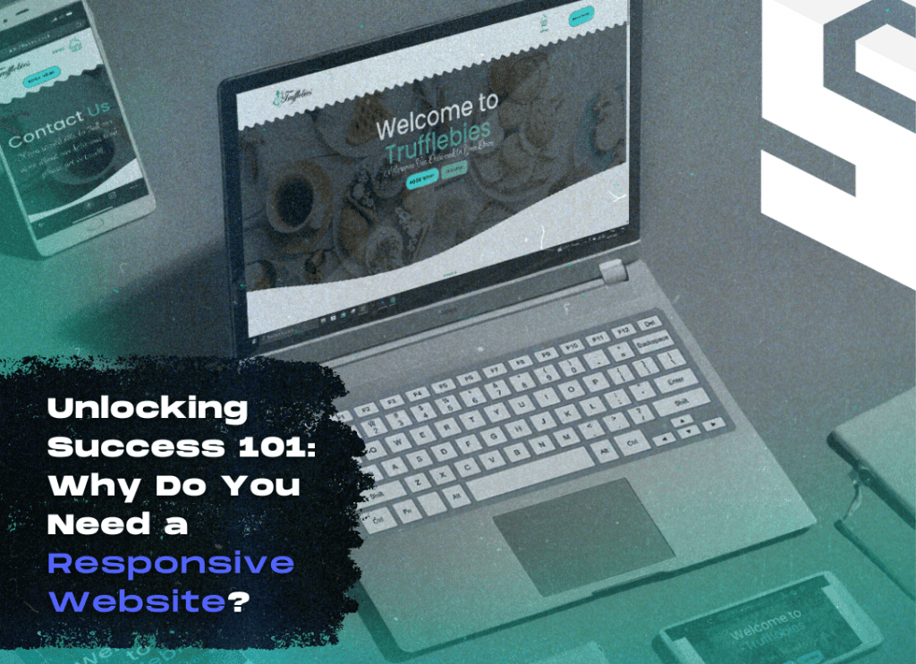
Why DO You Need a Responsive Website?
Picture this: you’re browsing the web on your phone, trying to find that perfect restaurant for date night. You click on a link, and bam! The site looks wonky, buttons are tiny, and you’re playing a game of zoom-and-scroll just to read the menu.
Frustrating, right? That’s where responsive websites swoop in to save the day.
The Beauty of Flexibility
You know how responsive websites are like the yoga masters of the internet? They can bend and stretch to fit any screen size – from the smallest smartphone to the biggest desktop monitor. How do they do it?
With a little thing called CSS magic. They’re all about rolling with flexible grids and layouts. That means everyone gets the full experience without any weird stretching or squishing.
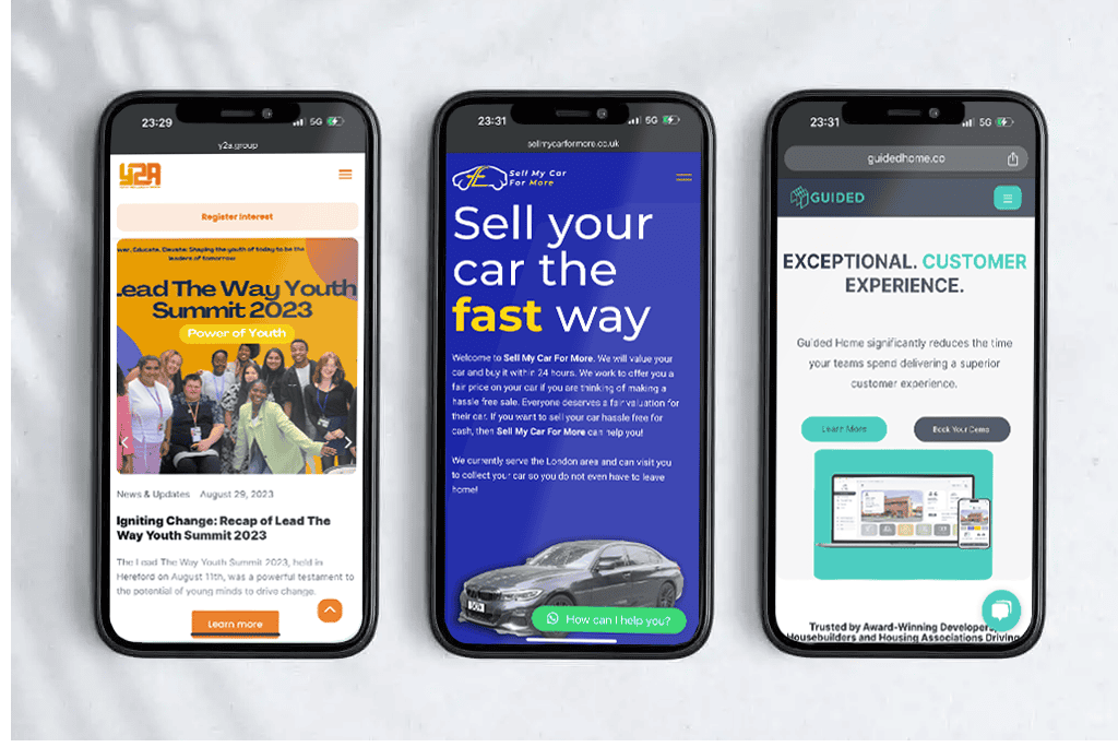

Say Hello to Mobile-Friendly Websites: The Benefits of Mobile First Design
Let’s talk about that little thing called “mobile-first design” again. We brought it up before, but it’s totally worth mentioning again. With everyone glued to their smartphones these days, it’s no wonder Google is all about that mobile phone-friendly vibe.
So what are the benefits of mobile first design?
Here’s the deal: when you prioritise your mobile site in the design process, you’re lining up some pretty sweet perks. We’re talking smoother user experiences, better search engine rankings, and a whole lot of love from Google.
Plus, with more and more mobile users, it just makes sense to give them the VIP treatment, right? So yeah, mobile-first design? It’s basically like giving your website a high-five from the future!
That’s not to say that desktop users are exstinct. You just have to consider there’s a wide variety of internet users.
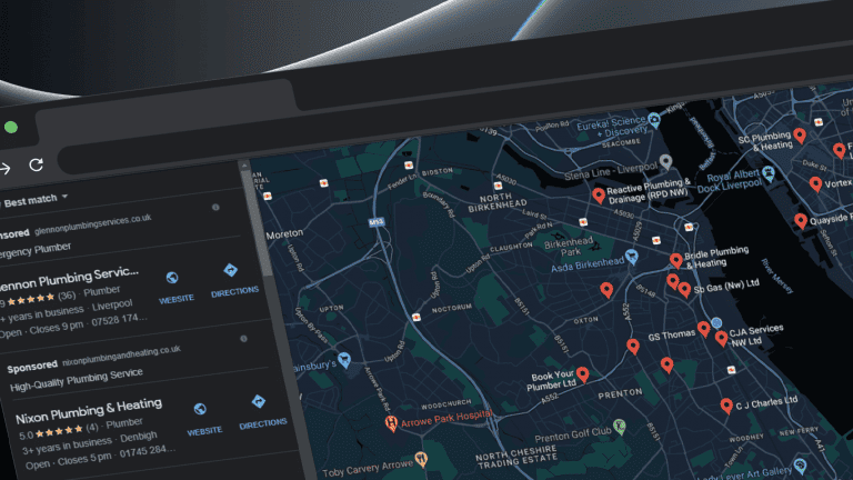
SEO: The Secret Sauce
Alright, let’s talk turkey – or rather, Google rankings.
You know those coveted top spots on the search results page? Yeah, responsive websites have a knack for snagging those. Why? Google’s all about making users happy, so they dig sites that get along well with mobile devices.
So, if your site isn’t responsive, you might be missing out on some serious SEO mojo.

User Experience: The Ultimate Deal-Maker
But wait, there’s more! A responsive website isn’t just good for Google – they’re a total game-changer for your users too.
Imagine this: you’re on the go, trying to find a quick answer to a burning question. You pull up a website, and bam!
See them as magic – everything looks perfect, buttons are clickable, and you find exactly what you’re looking for in seconds flat. That’s the power of a responsive website, my friend.
The Power of Adaptation
What does adaptability have to do with my website, you say? In today’s fast-paced world, things change at the drop of a hat. So, here’s the deal: new gadgets pop up, screens go from tiny to huge, and people’s expectations shoot through the roof.
With an adaptive website, you’re always one step ahead of the game. No sweat about trying to keep up with all the latest gadgets or constantly revamping your site every six months! Your website’s got your back for whatever comes next.
Making the Switch: It’s Easier Than You Think
Now, I know what you’re thinking: “But isn’t making my website responsive a huge hassle?”. Okay, so making the switch to responsive design might seem like a big deal – but trust me, it’s easier than you think!
With the right tools and a bit of savvy, you can easily turn your old-school website. Before you know it, you’ll have a slick mobile-friendly masterpiece.
Ready to Take the Plunge?
So, there you have it – the lowdown on responsive web design and why it’s the bee’s knees. From boosting your SEO to making your users happier, the perks are pretty darn clear.
Chances are, your website is the face of your business. So, it’s important that your mobile version is just as flashy as your desktop versions.
Using a mobile first approach when you create a website is definitely going to improve user experience!
If you’re ready to jazz up your online game, why not give responsive design a shot? Believe me, your website – and your users – will thank you for it.
Want to Learn More?
Still hungry for more juicy tidbits? I’ve got you covered. Drop me a line, and let’s chat. If you’re a start-up or small business aiming to level up, I’ve got your back to spruce up your website and amp up your online growth.
Together, we’ll turn your website into a lean, mean, mobile-friendly machine.
Check out my local web design service to see if your current website needs important updates!


